Icon Design
UHS Lifelines is a fully functional interface to the Electronic Patient Record (EPR) in use at University Hospital Southampton. All authorised users of CHARTS can access Lifelines via the tile on the CHARTS apps menu.
Lifelines offers a visualisation and interaction with the electronic patient record of every patient who is registered with UHS. It displays information and events on subject matter timelines as interactive icons.
Interactive icons are a common feature of operating systems and user interfaces on all computer and mobile phone screens, which are now taken for granted. There are nevertheless some interesting and important features to the icons in UHS Lifelines which merit further discussion in a blog post.
The brains behind the icons
Icons are visual objects which act as a point of interaction with a computer screen, using a mouse or by touch. They are generally square virtual objects, which are built of pixels. Pixels are in turn the building blocks of the modern computer screen. The dimensions are defined by the number of pixels on the X and Y axes, for example 800 x 600 pixels (low resolution screens), or 1920 x 1080 pixels (high resolution screens).
All software programming systems offer a palette of basic icon designs. For example, the standard icon sizes in the Microsoft C++ coding palette range from 16 x 16 to 256 x 256 pixels. The typical icon on a desktop interface comprises from 16 x16 to 256 X 256 icons, as for example in the Microsoft Windows 7 icon design basics information sheet (1).
The larger and higher resolution icons permit photorealistic imagery, but at a substantial cost in screen real estate and processing power. Microsoft aim for “an Authentic/Aesthetic, Energetic/Elegant/Emotional, Reflective and Open (A.E.R.O) user experience in their iconography, whose products should be “professional and beautiful”.
In contrast, we have adopted a 12 x 12 pixel icons as the standard element on UHS Lifelines. This small icon emerged early in our development process as an obvious and logical building block to meet our design intentions.
The choice of icon size to access and display documents, reports, admissions and test results, represents a compromise between a number of design parameters, which include our needs:
– to preserve the overview of the entire record on a single screen
– to maintain intuitive navigation around a clean and uncluttered EPR interface
– to preserve the structural integrity of the data in time and on every subject timeline
– to maximise our use of screen space, given that many patient records contain large numbers of documents and events
– to ensure an optimum “information density” on the screen to communicate information with the greatest ease and comfort, and least fatigue for the user
– to ensure error-free interactivity with a mouse cursor
– to ensure reliability and speed of loading and refreshing of the interface in clinical contexts such as a busy outpatient clinic
The positioning of each UHS Lifelines icon on the computer screen
The positions of all of the icons in UHS Lifelines are defined by the Metadata which describes the underlying content. For example, the metadata of a clinical letter will describe the date and time of creation, by whom and in which clinical discipline
Each icon on UHS Lifelines therefore occupies a specific time point on a specific subject timeline. Hovering over the icon with a mouse pointer will display the relevant metadata in a balloon. In the case of eDocs sourced content, this is information the same data as contained in the descriptor column against any document.
However, unlike the access icons on your personal device screen, UHS Lifeline icons also help tell the individual patient’s clinical story through their patterns and through relationships along the horizontal timeline axes and in their vertical (Y axis) patterns and linkages.
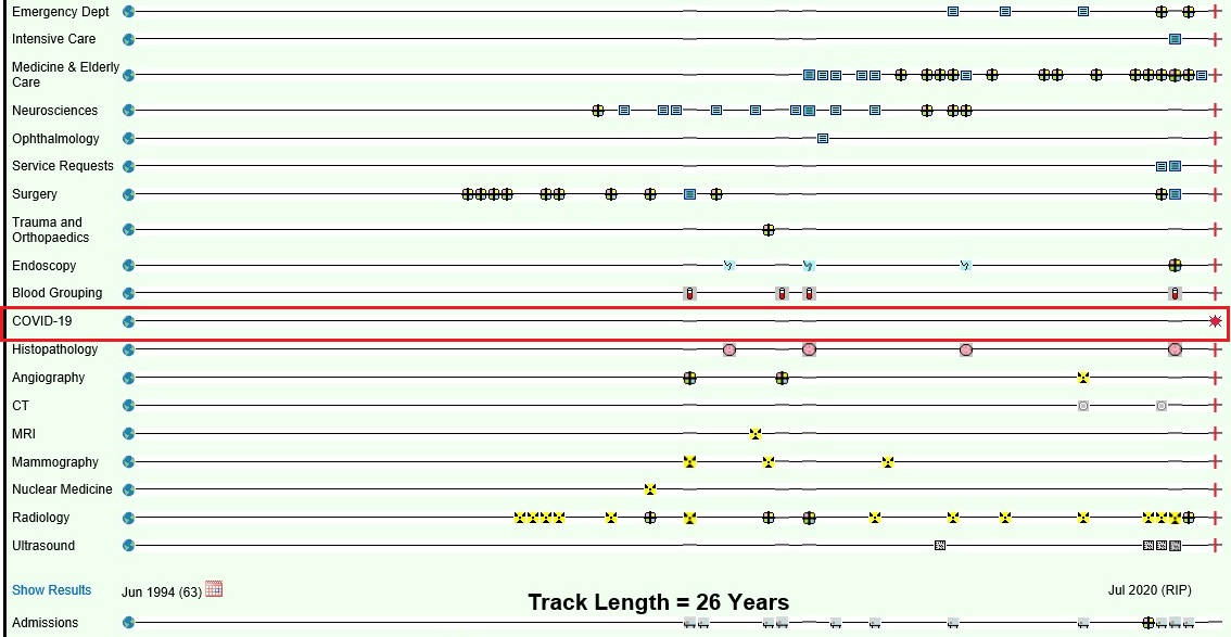
Covid added to Lifelines
Figure 1. This is a UHS Lifelines screenshot of the medical history of an elderly patient who was Covid-19 positive at the time of her death in hospital in 2020. The red rectangle is simply for highlighting purposes. This figure illustrates the range of 12×12 icons employed in the Lifelines design, and the flexibility to add new timelines as new content emerges.
Dynamic positioning
Within UHS Lifelines, each subject timeline fills the available screen width. The icons for the most recent documents and events are displayed towards the right end of the timeline.
The timeline length in Lifelines is fixed, which creates an interesting design challenge for UHS iconography. The passage of time is relentless and incremental, so icons will move to the left with time, as the EPR interface is continually reshaped and reformatted as the time frame expands to fit the constraints of the fixed screen size.
The icons will nevertheless always retain their relative position in time and space within the framework, much as a dynamically positioned survey ship will retain its position over a fixed spot on the sea bed despite the actions of tide and weather):
– as time passes
– as new content is added to the existing timelines
– as new timelines are added to the vertical axis of the interface (for example, Covid-19 test results in 2020)
The Challenges of Timeline and Icon Overload
- Icon Overlap:
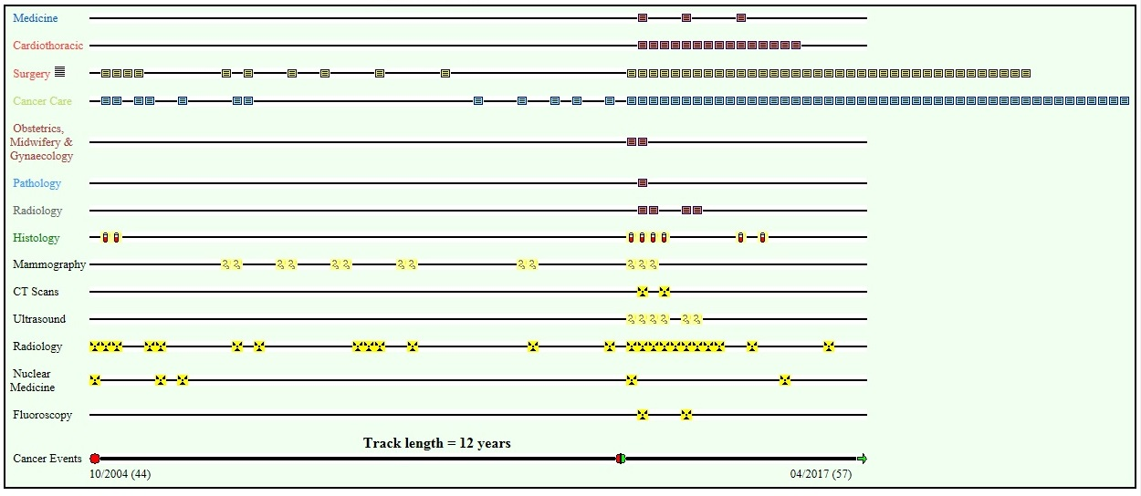
As the number of documents and events increases and as the timeline extends, there is increasing competition for display space for icons on the computer screen. This leads to icon overload and overlap at various points along any given timeline. This overlap progressively obscures the earlier icons as new icons crowd in. This problem is illustrated in Figure 2, which was an early design iteration of UHS Lifelines in 2010.
Icon overlap in Lifelines
Figure 2. This early version of Lifelines illustrates the problem of Icon Overlap, as on the cancer care timeline. Icon overlap progressively obscures the earlier icons.
- Lateral displacement
An alternative solution is simply to display icons in time sequence as they are generated. However, this leads to progressive disruption of the screen architecture, which can be extreme. This problem is illustrated in Figure 3.
TImeline overload
Figure 3. This illustrates the problem of Icon displacement on an early version of UHS Lifelines: In this model, icons are displayed on the next available space on the timeline, or “shuffled” along the timelines. This destroys the temporal integrity of the interface.
- The “Single Icon Multiple Event (SIMPLE) Solution” to timeline overload.
Our solution emerged from experimentation with undergraduate students from the School of Media Arts and Technology at Southampton Solent University in 2015-2016.
A “hybrid icon with a distinctive cruciate, cloverleaf or “hot cross bun” design displays a list of the content (documents and events) which are accessible by that icon in the hover-over metadata balloon (Figure 4). Clicking on the icon displays a frame which contains a list of all of the content in list format in descending order, from which any document or event can be selected and displayed (Figure 5).
Figure 4: screenshot of a content balloon to a multi-view icon in our test system
Figure 5. This screenshot of the multi-view frame is taken from our test system. The frame opens from a multi-view icon. The frame contains a list of the contents on the left hand side, each of which can be opened for viewing in the main frame.
- The Global Event Icon
We were asked to implement a device to display all documents and events on any one timeline in multi-view format. This would permit a fast scrolling review of the entire content of each timeline. The solution was a “global overview” icon, which is posted at the left hand end of every timeline (Figure 1). This works as a SIMPLE multiview icon.
Future Developments
UHS Lifelines is under continuous development by the UHS digital team. A significant upgrade (Lifelines-21) will be launched during 2021, with a range of new features. We welcome all feedback as to how the functionality of the system can be further improved.
Acknowledgements are due in particular to Alan Hales, David Cable, Matt Warren, Alex Mills-Mullett and Ryan Beegan for coding and implementation of the UHS Lifelines concept across the UHS Clinical Data Estate.
David Rew MChir FRCS
UHS Lifelines Concept Lead
University Hospital Southampton
27th March 2021
References
Alan Arthur Hales, David Cable, Eleanor Crossley, Callum Findlay and David Anthony Rew
Design and implementation of the stacked, synchronised and iconographic timeline-structured electronic patient record in a UK NHS Global Digital Exemplar hospital
BMJ Health and Care Informatics 2019, 26, Vol 1
Icons (Design basics)
https://docs.microsoft.com/en-us/windows/win32/uxguide/vis-icons (accessed 15.03.21)