The Principles of Data Visualisation and the Electronic Patient Record
The human eye and brain are optimised for visual presentation and interpretation of information through colour, shape, depth, movement and relative position.
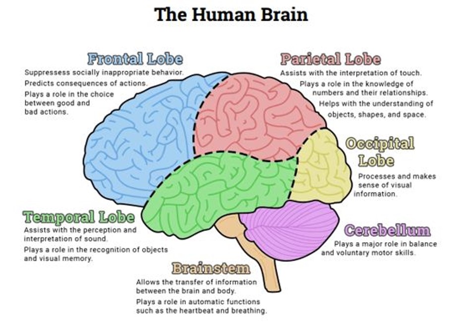
Figure 1. Adapted from The Human Brain Diagram, Therapist Aid 2015
It is therefore possible for us to visualise and interpret hugely complex information sets, such as are presented to us through every second of our lives, in ways which are immediately intelligible and highly intuitive.
Visually rich information will therefore be processed and interpreted through the visual cortex fare more quickly and efficiently than through text and tables, which require the more attention intensive and slower cerebral processing of the frontal cortex and forebrain.
This functionality is captured in the aphorism that “a picture is worth a thousand words”, and the significance of visualisation techniques has captured the attention of many great artists and graphic designers.
Conflict has been a powerful stimulus to human innovation, as has also been the case in the progression of data visualisation as a scientific tool.
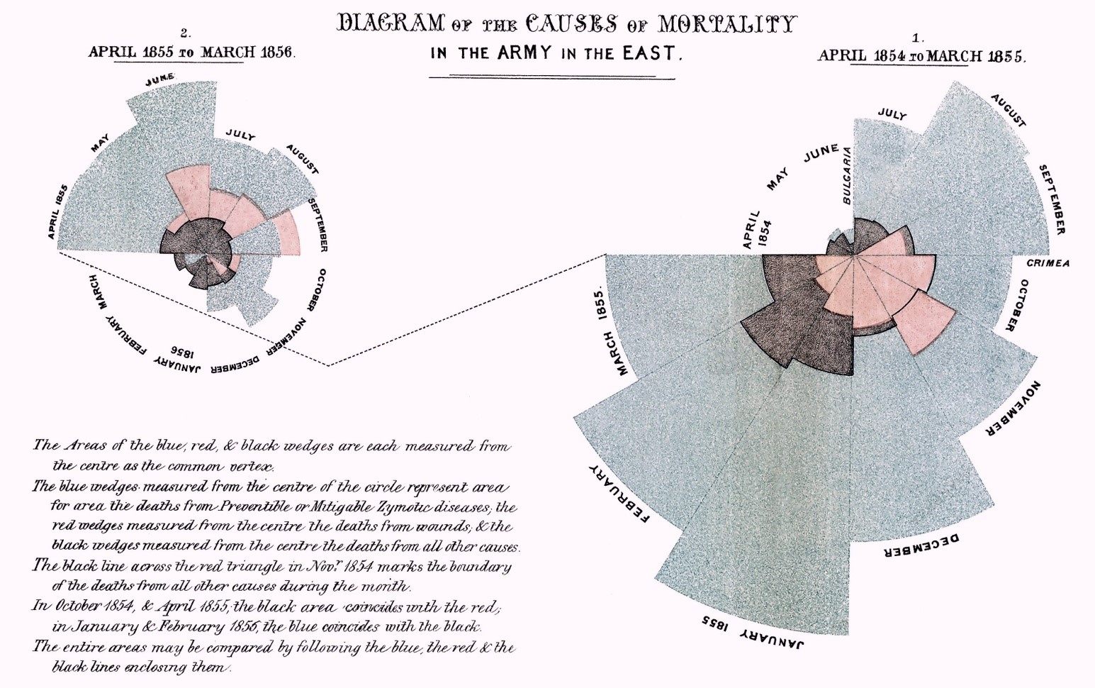
Figure 2. Florence Nightingale famously recorded the deaths of the soldiery from battle wounds and preventable infections and other diseases in her pie charts from the Crimea.
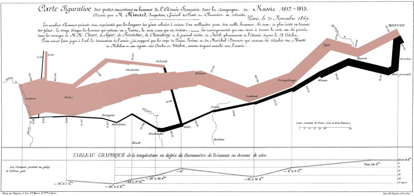
Napoleon’s disastrous campaign in Russia of 1812-1813 is brutally realised in multiple dimensions of data in Minard’s 1869 map of the campaign, drawn from a range of historical resources.
This map has been described as one of the best statistical graphics ever drawn. Napoleon crossed the River Vistula in 1812 with 400,000 men. Ravaged in battles and by the Russian winter, he returned the following year with only 10,000 survivors.
Among data visualisation aficionados, Edward Tufte’s textbook “The Visual Display of Quantitative Information” is a major and authoritative resource on the subject.
Data Visualisation in the Computer Age.
Computerisation radically advances the science of data visualisation. It creates the ability to manipulate, reshape, drill down and interact with data ad infinitum, thus adding multiple dimensions of depth, form and time to previously static representations.
Professor Ben Shneiderman of the Human Computer Interaction Laboratory at the University of Maryland, Washington DC has long been a leading researcher and advocate of design principles for the computer assisted visualisation of complex data sets.
He described the key design requirements for the design of advanced graphical user interfaces in his paper The eyes have it: A task by data type taxonomy for information visualizations, and for the optimum functionality for the visualisation of a complex data set.
There are four critical and sequential functions which are required of the system:
The Overview of the entire data set,
The ability to Zoom In on features of interest
The ability to Filter Out extraneous information
The ability of obtain Details on Demand of any feature of interest.
Shneiderman subsequently added a further three requirements
The ability to Relate features within the data set to each other
The ability to keep a History of interactions and exploration of the system
The ability to Extract sub-collections and query parameters
Prof Shneiderman also formulated his “Eight Golden Rules of Interface Design”, which have stood the test of time.
1. Strive for consistency. Consistent sequences of actions should be required in similar situations
2. Seek universal usability. Recognize the needs of diverse users and design for plasticity
3. Offer informative feedback: For every user action, there should be an interface feedback
4. Design dialogs to yield closure: Sequences of actions should be organized into groups with a beginning, middle, and end
5. Prevent errors: design the interface so that users cannot make serious errors
6. Permit easy reversal of actions: This feature relieves anxiety, since users know that errors can be undone, and encourages exploration of unfamiliar options.
7. Keep users in control: users must sense that they are in charge of the interface and that the interface responds to their actions
8. Reduce short-term memory load: Our limited capacity for information processing in short-term memory (the rule of thumb is that people can remember “seven plus or minus two chunks” of information) requires that designers avoid interfaces in which users must remember information from one display and then use that information on another display.
“Shneiderman’s Mantra” upon UHS Lifelines
Collectively, these principles have profoundly influenced our own work in Southampton, and Professor Shneiderman has also taken a generous and benevolent continuing interest in this work.
Some of our own imagery is displayed in the HCIL image galleries.
The key visualisation features in the UHS Lifelines EPR
UHS Lifelines is an interactive data system which is best understood through dynamic use rather than static imagery. Throughout its evolution, we have been strongly guided by the key principles of electronic data visualisation, in order to make the user experience as comfortable, intuitive and safe as possible. In the course of this work, we have introduced two further terms to describe our intentions:
- The system must be adapted for End User Optimisation: it must be the best it can be to serve the user’s immediate need. In the case of a clinical record, the primary purpose is to make the best and the safest clinical decision with the maximum relevant and critical information, while
- We aim for Maximum Simplification in the presentation of data, to avoid distraction, clutter and data overload. There is a generally tendency among computer software developers to add more and more functionality, much of which is rarely if ever used by the end user. This process of software expansion is known as bloatware, and it will be familiar to anyone who has ever used a computer.
It is a major challenge to reverse the tendency to functional expansion in user facing software, in order to realise the profound mantra that “less is more” in terms of effective functionality.
An excellent example of “radical simplification” in software design is the Google Search Screen. The elegant simplicity of the front end screen conceals huge functional power behind the scenes, and we have similarly aimed for this “elegance in simplicity” in our approach to the design of UHS Lifelines.
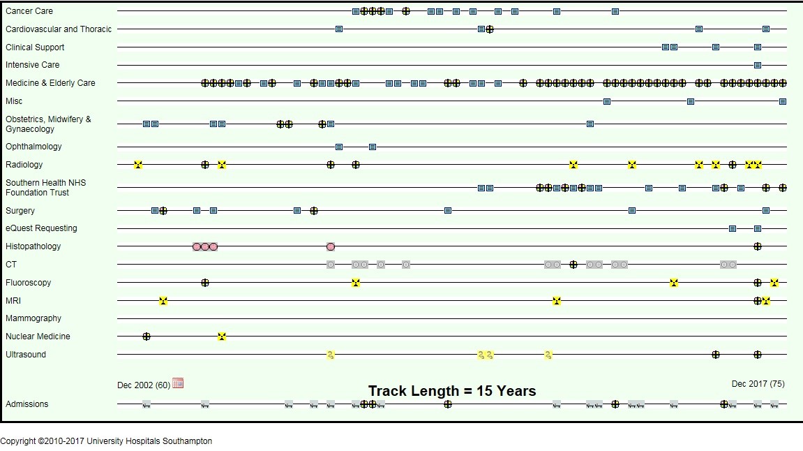
Screenshot: a patient with multiple medical comorbidities
Therefore, in respect of Ben Shneiderman’s four key recommendations
- UHS Lifelines defaults to an Overview screen of the totality of the clinical e-record. We consider this to be important, as it annuls the tendency of busy clinicians only to inspect their subject fields of interest in legacy list mode formats, and thus to risk missing key information. The Overview screen also maximises the speed of navigation around the record. The user only needs to dwell on the Overview screen very briefly, in navigating to key documents of interest.
- UHS Lifelines navigation is mouse-driven, so the user has the immediate capacity to Zoom In on any timeline, document or group of documents at will. Hovering over any document displays the key metadata for that document or group of documents.
- UHS Lifelines Filters Out “superfluous” timelines and content. It will only display timelines for which electronic content exists, thus eliminating the need to go searching in opened tabs to check whether or not content exists in a particular subject area. This substantially reduces time and effort spent in searching a record.
- UHS Lifelines accesses Details on Demand by the simple act on clicking on a document icon, which opens up the original document or report.
In future blog posts, we will consider the importance of pre-selection and stratification of clinical documents to minimise workload and examine key elements of UHS Lifelines in greater detail.
David Rew
Consultant General Surgeon
University Hospital Southampton
UHS Lifelines Concept Lead